UI/UX case study · 2024
SmitBridge Global Ventures
A corporate website that makes four very different consulting services easy to understand for communities, companies, and governments.
- Client
- SmitBridge Global Ventures LLC
- Industry
- Environmental & business consulting
- Location
- Nigeria (global reach)
- Year
- 2024
- Timeline
- 2 weeks
- My role
- UI/UX design & development
The challenge
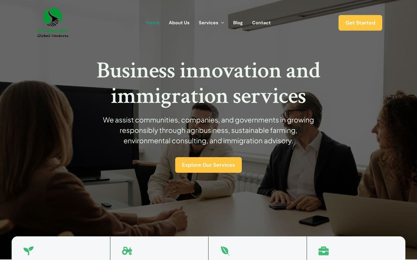
SmitBridge offers agribusiness, sustainable farming, environmental and immigration consulting, and business advisory services. The risk was a website that felt scattered. It needed to communicate the full breadth of services while still looking credible enough for government and enterprise clients.
My approach
- 01Grouped every offering into four clear service lines with consistent naming
- 02Designed a professional, trust-building interface suitable for government and enterprise clients
- 03Planned navigation around three client segments: communities, companies, and governments
- 04Used real-world photography of farming and fieldwork to support the sustainability story
- 05Added clear contact paths for enquiries across every service line
Key design decisions
what the design does and whyThe full offer in one glance
The four service lines sit in a single card row that overlaps the hero, so visitors see the complete scope of the business on the first screen without scrolling or opening menus.
A repeatable column pattern
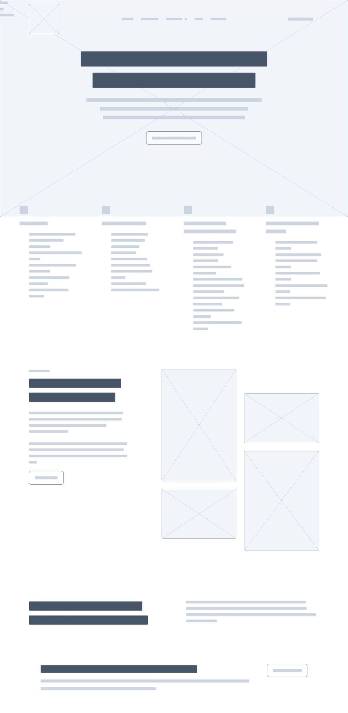
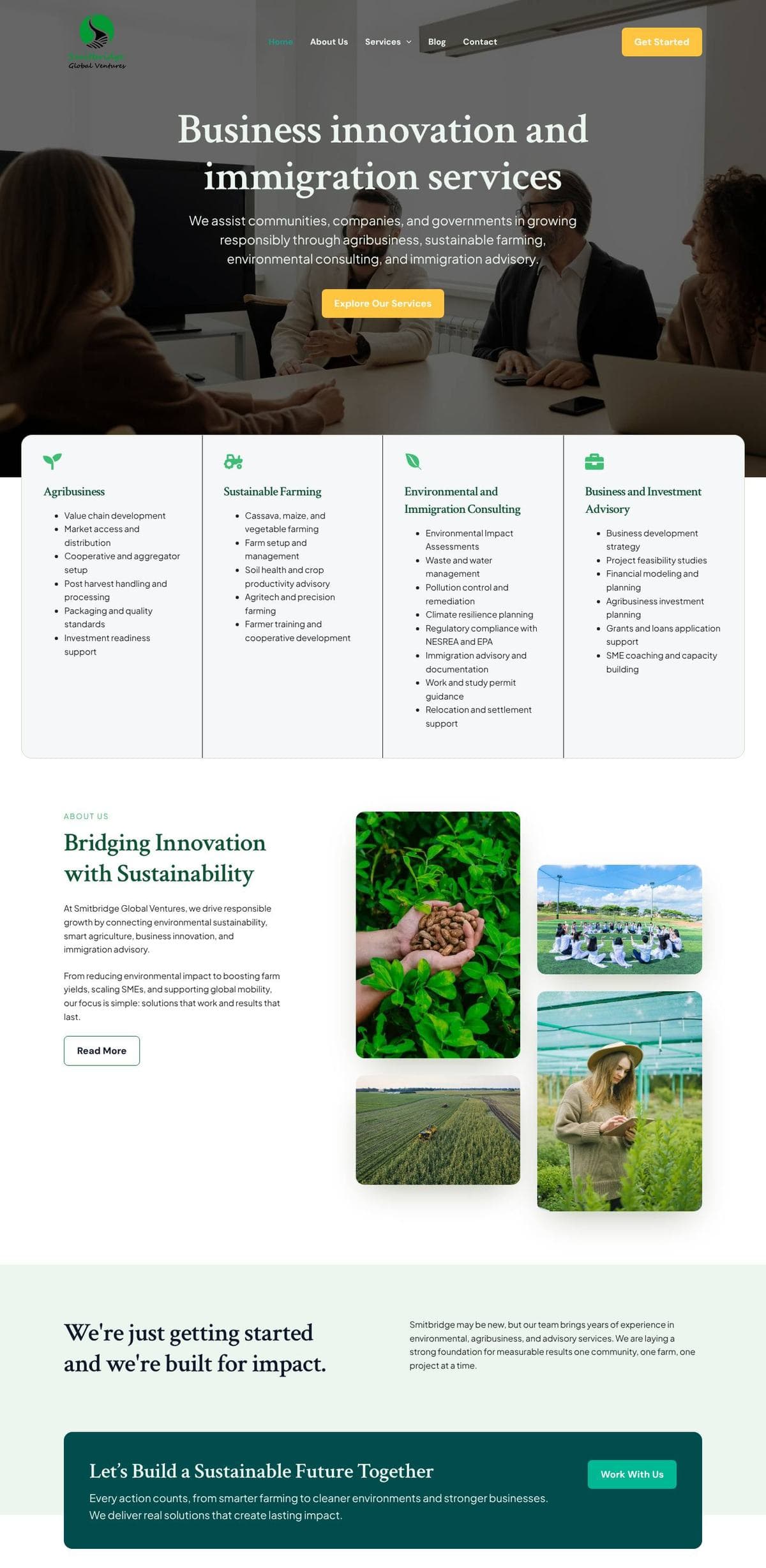
Each service column uses the same structure, an icon, a title, and a bulleted list of sub-services, which makes long lists easy to scan and compare.
One colour for action
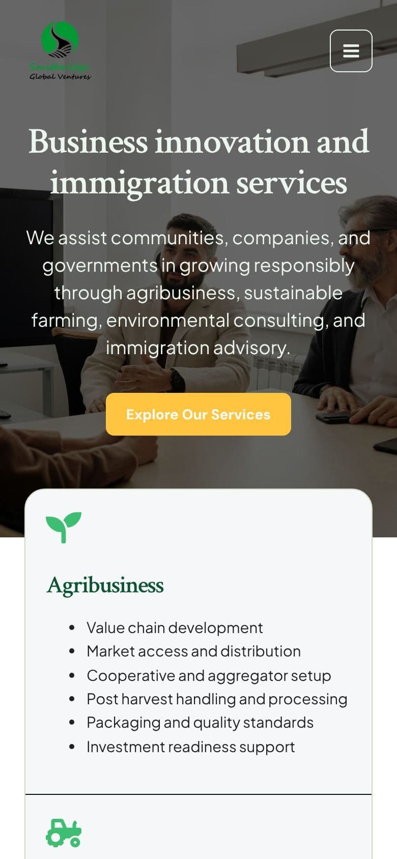
A single yellow is reserved for primary actions like “Get Started” and “Explore Our Services”, while deep green carries headings and brand moments. Visitors always know where to click.
Built-in trust signals
An asymmetric photo collage of real fieldwork and a closing “Let's Build a Sustainable Future Together” band reinforce credibility and end the page with a clear next step.
Structure and final design
The wireframe view strips the live page back to its layout and content hierarchy, next to the finished design on mobile.
 STRUCTURE
Outcome
- Brought four service lines together in one coherent, professional platform
- Gave each client segment a clear path to the services and contact options relevant to them
- Established a consistent corporate identity across desktop and mobile