UI/UX case study · 2025
BTO Global Foundation
A mission-driven website that turns a non-profit's environmental programs into clear paths for donors, partners, and volunteers.
- Client
- BTO Foundation for Environment and Climate Action
- Industry
- Non-profit / Environmental sustainability
- Location
- Africa
- Year
- 2025
- Timeline
- 5 days
- My role
- UI/UX design & development
The challenge
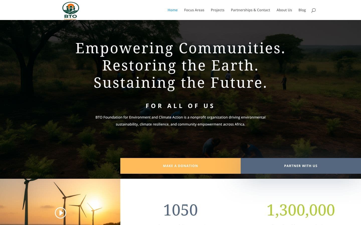
BTO needed a website that could explain a wide range of programs, from climate adaptation to its Waste-to-Wealth model for youth and women, while inspiring two very different audiences to act: individual donors and organisations looking to partner.
My approach
- 01Defined the two primary actions, donating and partnering, and gave each its own path from the first screen
- 02Organised six program areas into short, consistent summaries that visitors can scan before going deeper
- 03Used impact figures as early social proof to build trust before asking for support
- 04Designed for accessibility and readability so the content works for a broad, diverse audience
- 05Structured the content so the team can keep publishing program updates and impact reports
Key design decisions
what the design does and whyTwo audiences, two clear calls-to-action
Directly under the hero, “Make a Donation” and “Partner With Us” sit side by side. The donation button uses the warm accent colour for the highest emphasis, while partnering uses a calmer slate, so each audience recognises its path at a glance.
Proof before the ask
Impact numbers, 1,050 volunteers & partners and ₦1.3M in support contributions, appear right after the calls-to-action, giving first-time visitors a reason to trust the foundation.
Scannable program cards
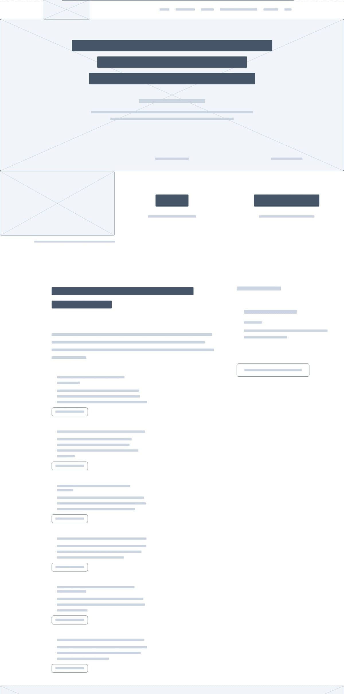
Each focus area follows the same pattern: a short uppercase title, a two-line summary, and a “Learn more” link. The repetition makes six programs easy to compare without overwhelming the page.
Thumb-friendly on mobile
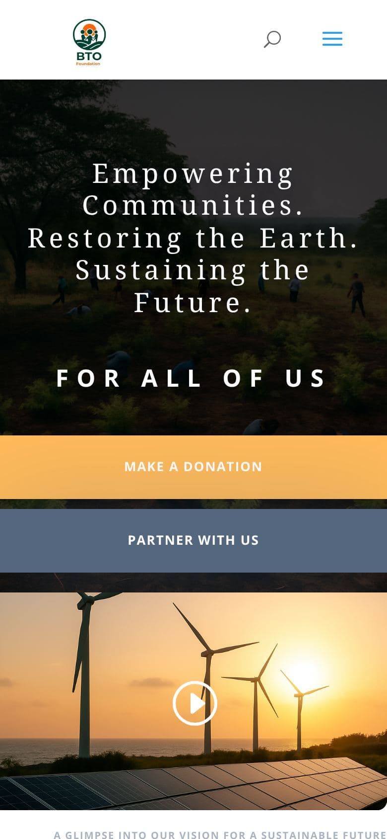
On phones, the two calls-to-action become full-width stacked blocks with large tap targets, keeping the primary actions within easy reach.
Structure and final design
The wireframe view strips the live page back to its layout and content hierarchy, next to the finished design on mobile.
 STRUCTURE
Outcome
- Launched a complete, responsive website in five days
- Gave donors and partners separate, clearly signposted paths to get involved
- Created a content structure the foundation can grow with program updates and impact reporting